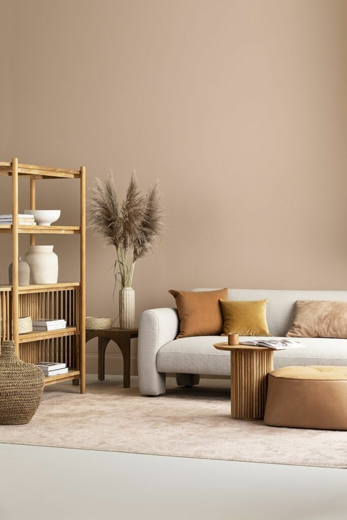
Are you tired of the same old color schemes in your designs? Why not try incorporating brown color palettes into your next project? Brown is a versatile color that can bring warmth, elegance, and earthiness to your designs. In this article, we will explore the basics of brown color palettes and how to use them effectively.
Understanding Brown Color Palettes
Brown is a color that is associated with nature, stability, and comfort. It is often used in design to create a warm and inviting feel. Brown color palettes can range from light, sandy tones to deep, rich chocolates. The key to using brown effectively is to pair it with complementary colors that enhance its natural beauty.

Creating a Brown Color Palette
When creating a brown color palette, it is important to consider the mood and tone of your design. Lighter, more neutral browns can create a calming and soothing atmosphere, while darker browns can add depth and richness to your design.
One effective way to create a brown color palette is to start with a neutral base color, such as beige or ivory, and then layer different shades of brown on top. This can create a cohesive and harmonious color scheme that is both elegant and sophisticated.

Using Brown in Design
Brown can be used in a variety of design elements, such as backgrounds, text, and graphics. When using brown as a background, it is important to choose a complementary text color that is easy to read. Dark brown backgrounds can work well with light, contrasting text colors, while lighter brown backgrounds can pair well with darker text.
When using brown in graphics, it is important to consider the mood and tone of your design. Lighter, more neutral browns can create a calming and soothing atmosphere, while darker browns can add depth and richness to your design. Brown graphics can also be used to create a natural and earthy feel.

Conclusion
In conclusion, brown color palettes can add warmth, elegance, and earthiness to your designs. When using brown in design, it is important to consider the mood and tone of your design and pair it with complementary colors that enhance its natural beauty. With the basics of brown color palettes in mind, you can create beautiful and effective designs that stand out.
Some interesting articles for your attention:
The meaning behind soft pastel colours aesthetic
The Power of Blue Aesthetic: Meaning and Impact
Understanding Amber Color: Theory & Meaning
The Psychology of Ivory Color in Design
The Power of Violet Color in Marketing


