In the vibrant spectrum of colors that we encounter daily, muted colors hold a unique place. Often overlooked in favor of their brighter counterparts, these understated hues possess a subtle power that significantly influences mood and perception. This article delves into the psychological impact of muted color palettes, exploring their calming effects, sophisticated subtlety, and influence on consumer behavior and emotional responses in various environments.
Understanding Muted Colors
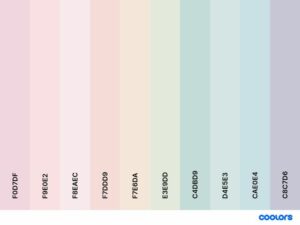
Muted colors are those which have been dulled or grayed, often described as soft, pastel, or earthy. Unlike vivid colors that leap out, these shades whisper, creating an atmosphere of calm and serenity. This subtlety is not just a matter of aesthetics but has deep psychological implications.
The Calming Effect of Pastels
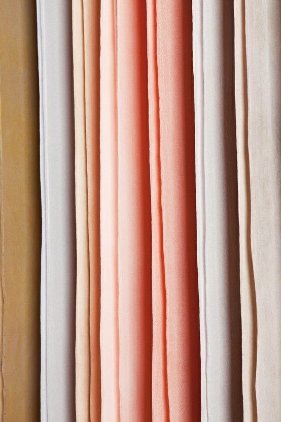
Pastel colors, a subset of muted colors, are known for their soothing properties. Colors like soft lavender, pale blue, and gentle pink have a calming effect on the mind. This phenomenon is rooted in color psychology, where these hues are associated with tranquility and mental peace. In settings like hospitals or mental health centers, pastel colors are often used to create a healing and serene environment.
Sophistication and Subtlety
Muted tones are synonymous with sophistication and elegance. Colors like charcoal, olive, or navy, when muted, lend a sense of understated luxury. They are often the go-to palette for brands that wish to convey elegance and sophistication. In interior design, muted colors create a backdrop that is both timeless and versatile, allowing for the interplay of textures and shapes to take center stage.
Influence on Consumer Behavior
The impact of color on consumer behavior is well-documented. Muted colors, in particular, have a unique influence. They are often used to create a sense of quality and timelessness in products. In the fast-paced world of consumer goods, a muted palette can make a product stand out by conveying a message of durability and class.
Muted Colors in Different Settings
In Homes
The use of muted colors in homes can create a sanctuary away from the bustling outside world. Soft greens, blues, and grays are perfect for bedrooms, promoting rest and relaxation. Living spaces adorned in muted tones foster a sense of warmth and comfort, encouraging family gatherings and relaxation.
In Offices
The right color palette in an office can significantly impact productivity and employee well-being. Muted colors can reduce the sensory overload that often comes with bright and bold colors. By using muted tones, offices can become spaces of focus and efficiency, with a calm ambiance that reduces stress.
In Retail Spaces
In retail, the color scheme can profoundly influence customer experience and purchasing behavior. Muted colors in a store can create an upscale feel, encouraging customers to perceive products as high-quality and worth the investment. They also allow the products themselves, which might be brighter or more patterned, to stand out.
Conclusion
Muted colors, in their subtlety and sophistication, play a crucial role in shaping our emotional and behavioral responses. Their calming effect, ability to convey sophistication, and influence on consumer behavior make them a powerful tool in various settings. Whether in homes, offices, or retail spaces, the psychological impact of these understated hues is profound and far-reaching. As we continue to explore the depths of color psychology, the muted palette remains a testament to the power of subtlety in our visually driven world.
The Sepia Color Palette: How to Use it in Design
Pink Color Schemes: Ideas and Inspiration
Exploring the Various Shades of Hunter Green