
In recent years, there has been an increasing use of fuchsia color in branding. However, to use it effectively, it is necessary to understand its meaning and how it affects people. In this article, we’ll discuss everything you need to know about fuchsia color in branding and how to use it effectively.
What is fuchsia color?
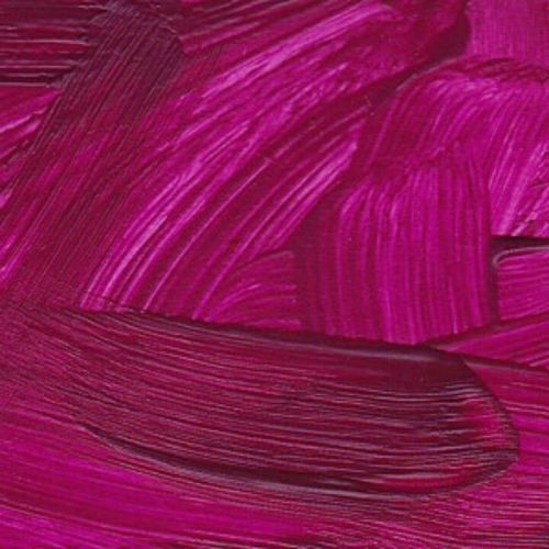
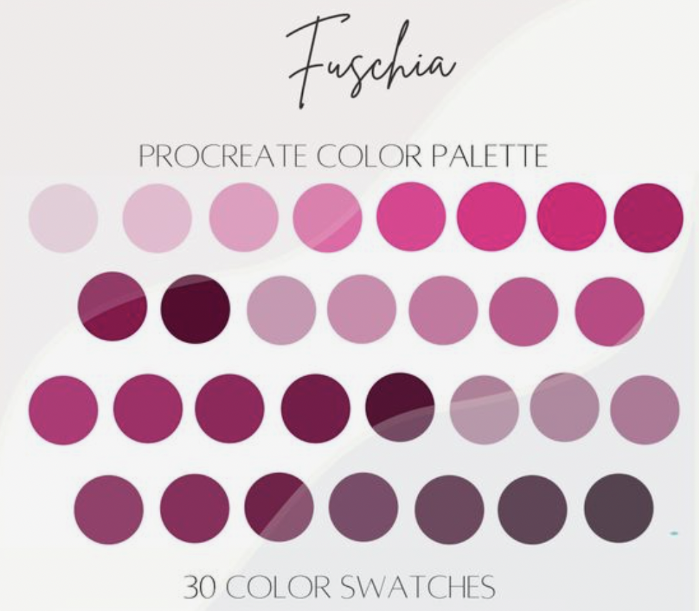
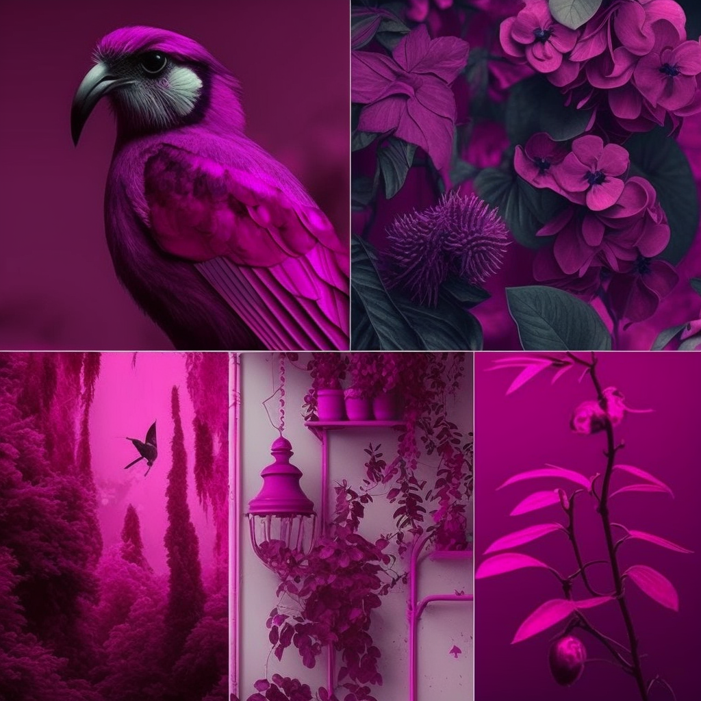
Fuchsia is a vivid purplish-red color that is named after the fuchsia flower. It’s a combination of red and purple and is known for its vibrancy and energy. Fuchsia is often associated with femininity, romance, and passion, but it can also represent confidence, creativity, and innovation.
Fuchsia color in branding
The use of fuchsia color in branding has become increasingly popular in recent years, especially in the fashion and beauty industries. Fuchsia can make a brand stand out from competitors and create a memorable impression on customers. However, it’s essential to use fuchsia color carefully to avoid overusing it or sending the wrong message.
When to use fuchsia color in branding
Fuchsia color is a good choice when a brand wants to communicate creativity, innovation, and modernity. It can also be used to represent luxury and exclusivity, especially when combined with gold or silver. However, it may not be suitable for all brands, especially those that aim to convey stability, tradition, and conservatism.
How to use fuchsia color in branding
When using fuchsia color in branding, it’s important to keep in mind the following:
- Use it as an accent color, not as the primary color.
- Combine it with complementary colors that enhance its vibrancy and energy, such as black, white, or light grey.
- Avoid using it in excess or inappropriately, as it can create a tacky and unprofessional look.
- Consider the target audience and the message the brand wants to convey.
Examples of fuchsia color in branding
Let’s take a look at some examples of brands that use fuchsia color effectively:
Victoria’s Secret
Victoria’s Secret, a lingerie and beauty brand, is known for using fuchsia color in its branding. The color represents femininity, romance, and passion, which are key elements of the brand’s identity.

T-Mobile
T-Mobile, a mobile network operator, uses a shade of fuchsia called “magenta” in its branding. The color represents innovation and modernity, which are important values for the company. Magenta is also a distinctive color that sets T-Mobile apart from its competitors.
Conclusion
Fuchsia color can be an effective tool in branding when used appropriately. By following the guidelines we’ve discussed in this article, brands can use fuchsia color to communicate creativity, innovation, and modernity, and create a memorable impression on customers. Remember to use fuchsia color as an accent color, combine it with complementary colors, and consider the target audience and the message the brand wants to convey.
[…] Fuchsia Color in Branding: How to Use It Effectively […]
[…] Fuchsia Color in Branding: How to Use It Effectively […]