
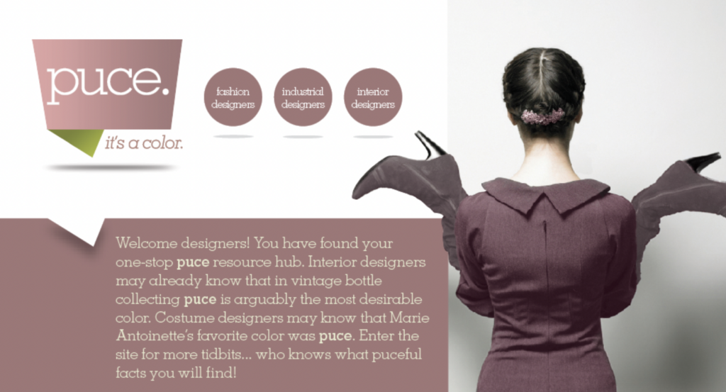
What is Puce Color?
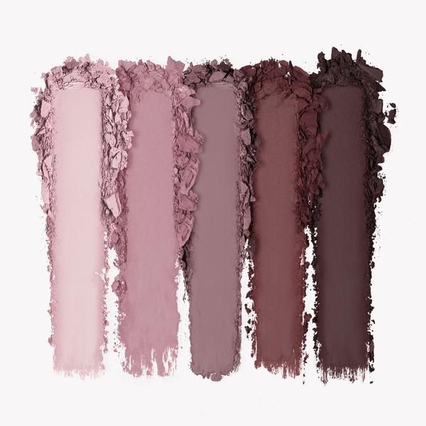
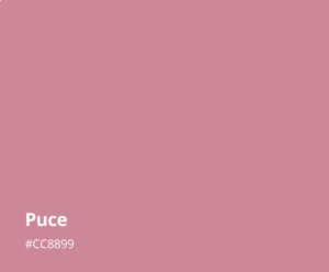
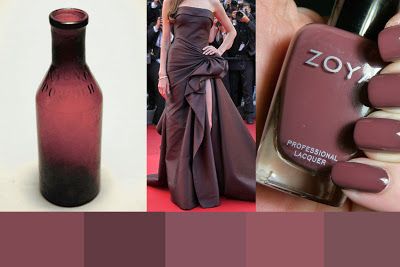
Puce color is a pale red or purple-brown color that is named after the French word for flea. It is a color that is commonly used in the fashion industry, especially in women’s clothing. Puce color has a unique characteristic that makes it stand out from other colors, as it can be both warm and cool depending on the tone used.
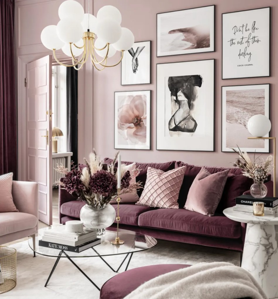
Puce Color Combinations
Puce color can be used as the main color in a design or as an accent color. When used as the main color, it can create a warm and inviting atmosphere. When used as an accent color, it can add a pop of color and interest to the design.
Here are some Puce color combinations that can be used in graphic design:
- Puce and White: Puce color can be paired with white to create a clean and elegant design. This combination is ideal for wedding invitations and other formal events.
- Puce and Black: Puce color can be paired with black to create a sophisticated and modern design. This combination is ideal for fashion and beauty brands.
- Puce and Green: Puce color can be paired with green to create a natural and calming design. This combination is ideal for eco-friendly brands and nature-inspired designs.
- Puce and Gold: Puce color can be paired with gold to create a luxurious and opulent design. This combination is ideal for high-end brands and luxury products.
How to Use Puce Color in Graphic Design
Puce color can be used in various ways in graphic design, such as:
- Background Color: Puce color can be used as a background color to create a warm and inviting atmosphere. This is ideal for websites, social media posts, and advertisements.
- Text Color: Puce color can be used as a text color to create a unique and eye-catching design. This is ideal for headings, subheadings, and call-to-actions.
- Image Overlay: Puce color can be used as an image overlay to add depth and interest to a design. This is ideal for product images and social media posts.
- Pattern: Puce color can be used as a pattern to create a unique and memorable design. This is ideal for packaging and branding.
Best Practices for Using Puce Color in Graphic Design
When using Puce color in graphic design, it is important to keep in mind the following best practices:
- Contrast: Puce color can be difficult to read on certain backgrounds. It is important to ensure that there is enough contrast between the Puce color and the background color to make the text legible.
- Consistency: Puce color should be used consistently throughout the design to create a cohesive and professional look.
- Hierarchy: Puce color should be used strategically to draw attention to the most important elements of the design, such as headings and call-to-actions.
- Audience: Puce color may not be suitable for all audiences. It is important to consider the target audience when using Puce color in a design.
Conclusion
Puce color is a versatile and unique color that can add interest and depth to graphic designs. When used correctly, Puce color can create visually appealing and effective designs that can outrank other websites. By following the best practices and experimenting with different combinations, designers can create unique and memorable designs that leave a lasting impression on their audience.
In conclusion, incorporating Puce color into your graphic design can be a powerful way to make your brand or product stand out. Puce color can be used in a variety of ways, from background color to text color to image overlay and pattern. When used correctly and consistently, Puce color can evoke a specific response from your audience and leave a lasting impression. Remember to follow best practices, such as ensuring enough contrast and considering your target audience, to create the most effective design possible.
With these tips in mind, you are well on your way to creating eye-catching and effective designs that incorporate the unique and versatile characteristics of Puce color. So go ahead and experiment with this color and let your creativity shine!
Some interesting articles for your attention:
[…] How to Use Puce Color in Graphic Design […]
[…] How to Use Puce Color in Graphic Design […]