
Creating a retro color palette is a great way to infuse nostalgia into modern designs. Retro colors, also known as vintage or antique hues, are a popular choice for designers looking to evoke emotions of the past. In this ultimate guide, we will explore how to create a retro color palette, which colors to use, and how to use them effectively to make your designs stand out.
-
What are Retro Colors?
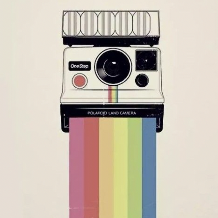
Retro colors are colors that evoke nostalgia for the past. They are commonly associated with the colors used in designs from the 1950s to the 1980s. These colors can be used to create a vintage or antique feel, but can also be used in modern designs to add a touch of nostalgia.
-
Why Use Retro Colors?
Using retro colors in your designs can help create an emotional connection with your audience. Retro colors are associated with the past, and they can help evoke emotions and memories from that time. Additionally, retro colors can add a unique and memorable touch to your designs that will make them stand out from the crowd.
-
How to Create a Retro Color Palette
Creating a retro color palette can be a fun and creative process. The key is to use colors that are associated with the time period you are trying to evoke. Here are some steps to follow when creating a retro color palette:
Step 1: Choose a Time Period
The first step in creating a retro color palette is to choose a time period to evoke. Each era has its own unique color palette that can be used to create a retro feel. For example, the 1950s were known for pastel colors such as pink, mint green, and baby blue, while the 1970s were known for earthy tones like avocado green and burnt orange.
Step 2: Research Colors from the Chosen Time Period
Once you have chosen a time period, it’s time to research the colors used during that time. Look for images, advertisements, and designs from that era to get an idea of the color palette used. You can also look for color inspiration from vintage clothing, furniture, and household items.
Step 3: Choose Your Color Scheme
After you have done your research, it’s time to choose your color scheme. The key to a successful retro color palette is to choose colors that complement each other and are commonly associated with the chosen time period. You can use a color wheel to help you choose colors that work well together.
Step 4: Test Your Color Palette
Before using your retro color palette in your designs, it’s a good idea to test it. Use a color swatch to see how the colors look together, and make adjustments if necessary.
-
Which Colors to Use
When creating a retro color palette, it’s important to choose colors that are commonly associated with the time period you are trying to evoke. Here are some examples of retro color palettes from different eras:
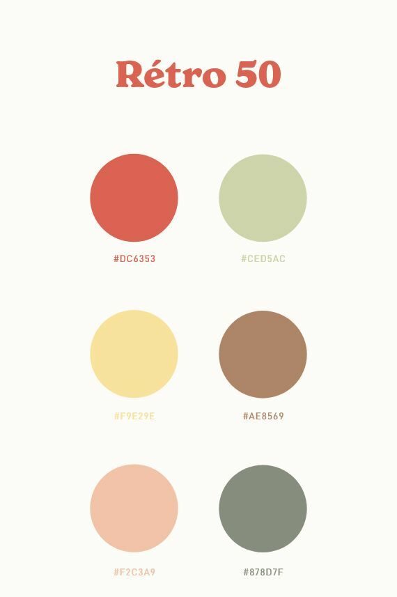
1950s: Pastel colors such as pink, mint green, baby blue, and pale yellow.
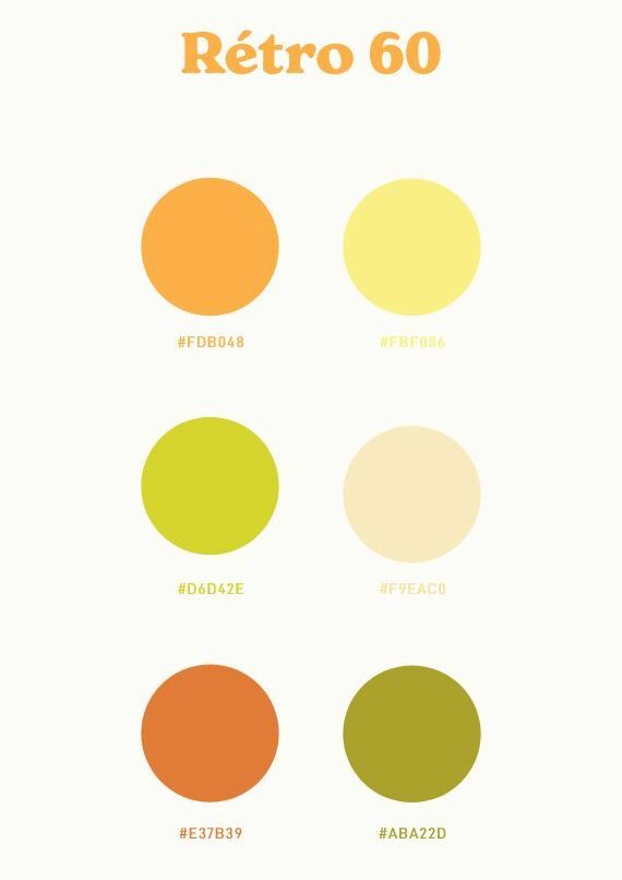
1960s: Bright colors such as orange, turquoise, and hot pink, as well as earthy tones like olive green and mustard yellow.
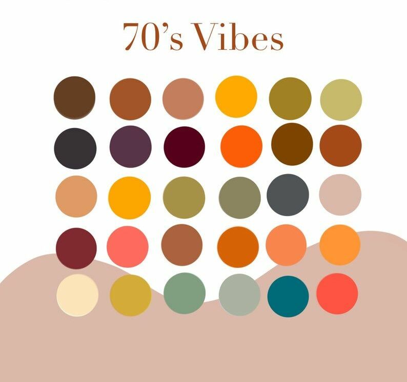
1970s: Earthy tones like avocado green, burnt orange, and harvest gold, as well as bright colors like fuchsia and teal.
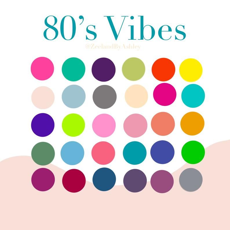
1980s: Bright and bold colors like neon pink, electric blue, and lime green, as well as pastel colors like lavender and peach.
-
Using Retro Colors in Your Designs
Now that you have created a retro color palette, it’s time to use it in your designs. Here are some tips for using retro colors effectively:
- Use retro colors as accents: Retro colors can be overpowering if used too much. Instead, use them as accents to add a touch of nostalgia to your designs.
- Use retro colors with neutral colors: To balance out the boldness of retro colors, pair them with neutral colors such as white, black, or gray.
- Use retro colors in patterns: Retro colors work well in patterns such as stripes or polka dots. Use them in combination with other colors to create a unique and eye-catching design.
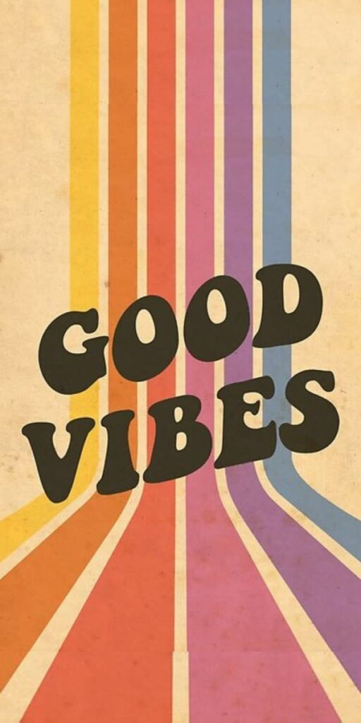
- Use retro colors in typography: Retro colors can be used in typography to create a vintage feel. Use them in combination with vintage fonts to create a unique and nostalgic look.
-
Best Practices for Creating a Retro Color Palette
When creating a retro color palette, there are some best practices to keep in mind. Here are some tips to help you create a successful retro color palette:
- Keep it simple: A retro color palette should be simple and not too overwhelming. Stick to a few colors that complement each other and work well together.
- Use complementary colors: Complementary colors are colors that are opposite each other on the color wheel. Using complementary colors can create a bold and eye-catching design.
- Consider your audience: When creating a retro color palette, consider your audience and the emotions you want to evoke. Different color palettes can create different emotional responses, so choose colors that resonate with your target audience.
- Be consistent: Consistency is key when using a retro color palette. Use the same colors consistently throughout your designs to create a cohesive and memorable look.
- Test your color palette: Before using your retro color palette in your designs, test it to make sure it works well together. Use a color swatch or design software to see how the colors look in different combinations.
-
Frequently Asked Questions
Q: What is a retro color palette? A: A retro color palette is a collection of colors that evoke nostalgia for the past. They are commonly associated with the colors used in designs from the 1950s to the 1980s.
Q: How do I create a retro color palette? A: To create a retro color palette, choose a time period, research colors from that time period, choose your color scheme, and test your color palette.
Q: What are some examples of retro colors? A: Examples of retro colors include pastel colors like pink and baby blue (1950s), bright colors like orange and hot pink (1960s), earthy tones like avocado green and burnt orange (1970s), and neon colors like pink and lime green (1980s).
Q: How do I use retro colors in my designs? A: Use retro colors as accents, pair them with neutral colors, use them in patterns, and use them in typography.
Q: What are some best practices for creating a retro color palette? A: Keep it simple, use complementary colors, consider your audience, be consistent, and test your color palette.
-
Conclusion
Creating a retro color palette can add a unique and memorable touch to your designs. When creating a retro color palette, choose colors that are commonly associated with the time period you are trying to evoke, and use them effectively in your designs. By following best practices and considering your audience, you can create a successful and nostalgic retro color palette that will make your designs stand out.

Some interesting articles for your attention:
Gorgeous Soft Autumn Color Palette for Cool Skin Tones
Fuchsia Color in Branding: How to Use It Effectively
Understanding Lavender Color: Tips for Designers